Check nearby libraries
Buy this book

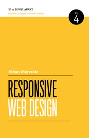
From mobile browsers to netbooks and tablets, users are visiting your sites from an increasing array of devices and browsers. Are your designs ready? Learn how to think beyond the desktop and craft beautiful designs that anticipate and respond to your usersâ needs. Ethan Marcotte will explore CSS techniques and design principles, including fluid grids, flexible images, and media queries, demonstrating how you can deliver a quality experience to your users no matter how large (or small) their display.
Check nearby libraries
Buy this book

Previews available in: English French
| Edition | Availability |
|---|---|
| 1 |
cccc
|
| 2 |
zzzz
|
| 3 |
zzzz
|
| 4 |
cccc
|
| 5 |
zzzz
|
| 6 |
aaaa
|
Book Details
Table of Contents
Edition Notes
Classifications
Contributors
Edition Identifiers
Work Identifiers
Work Description
From the publisher's website:
"From mobile browsers to netbooks and tablets, users are visiting your sites from an increasing array of devices and browsers. Are your designs ready? Learn how to think beyond the desktop and craft beautiful designs that anticipate and respond to your users’ needs. Ethan Marcotte will explore CSS techniques and design principles, including fluid grids, flexible images, and media queries, demonstrating how you can deliver a quality experience to your users no matter how large (or small) their display."
Links outside Open Library
Community Reviews (0)
| May 11, 2025 | Edited by ImportBot | import existing book |
| August 20, 2021 | Edited by ImportBot | import existing book |
| July 22, 2019 | Edited by MARC Bot | remove fake subjects |
| July 22, 2017 | Edited by Mek | adding subject: In library |
| March 28, 2011 | Created by George | Added new book. |


